Client: Round Table Hospitality Co.
Scope: Brand Identity, Visual System, Print + Digital Collateral
Scope: Brand Identity, Visual System, Print + Digital Collateral
Challenge
Round Table Hospitality approached Kalakatta Studio with a vision that spanned global cuisine, fine dining, quick service, and restaurant consultancy. The challenge was to create a unifying brand identity for an umbrella company that could represent this breadth of expertise while maintaining sophistication, inclusivity, and warmth. The brand needed to reflect excellence and reliability across multiple touchpoints — from fine-dining ventures to catering partnerships — positioning Round Table as a trusted leader and collaborative force in the evolving hospitality landscape.
Solution
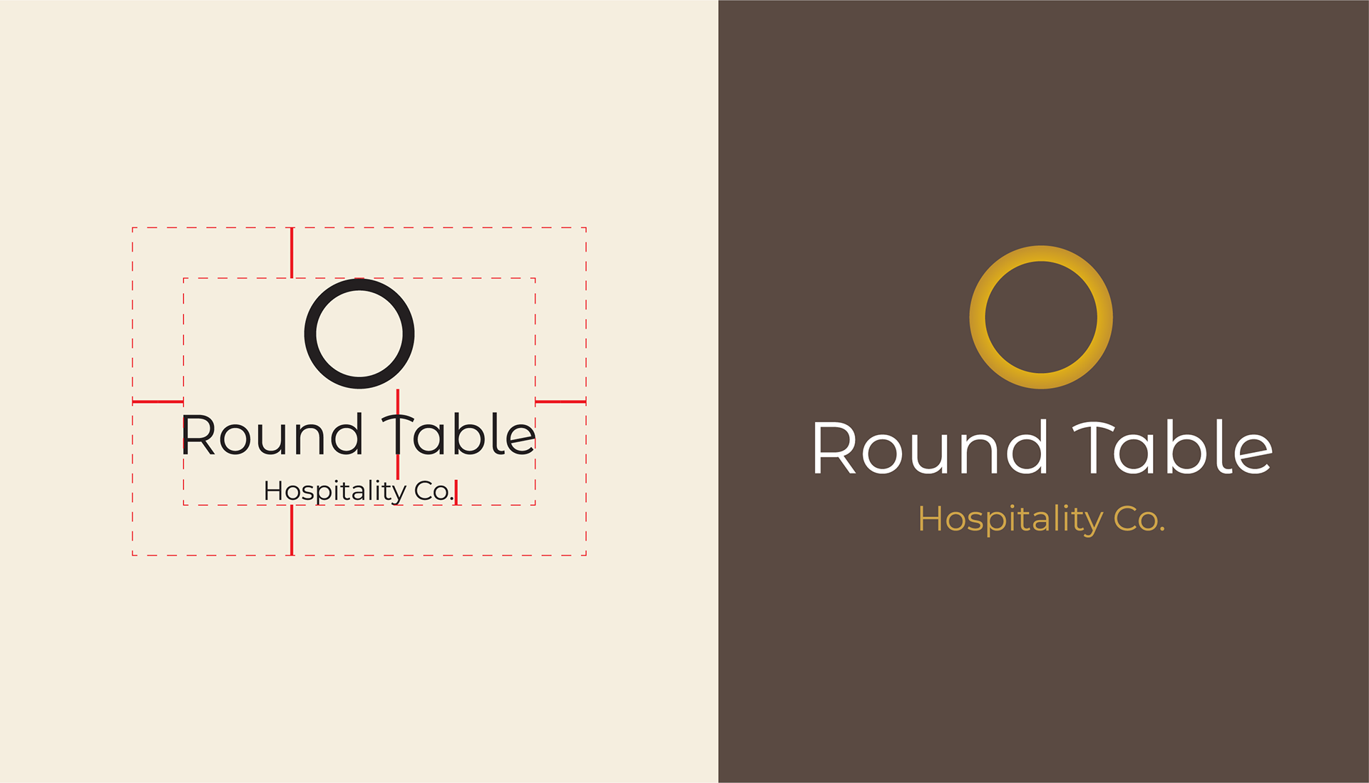
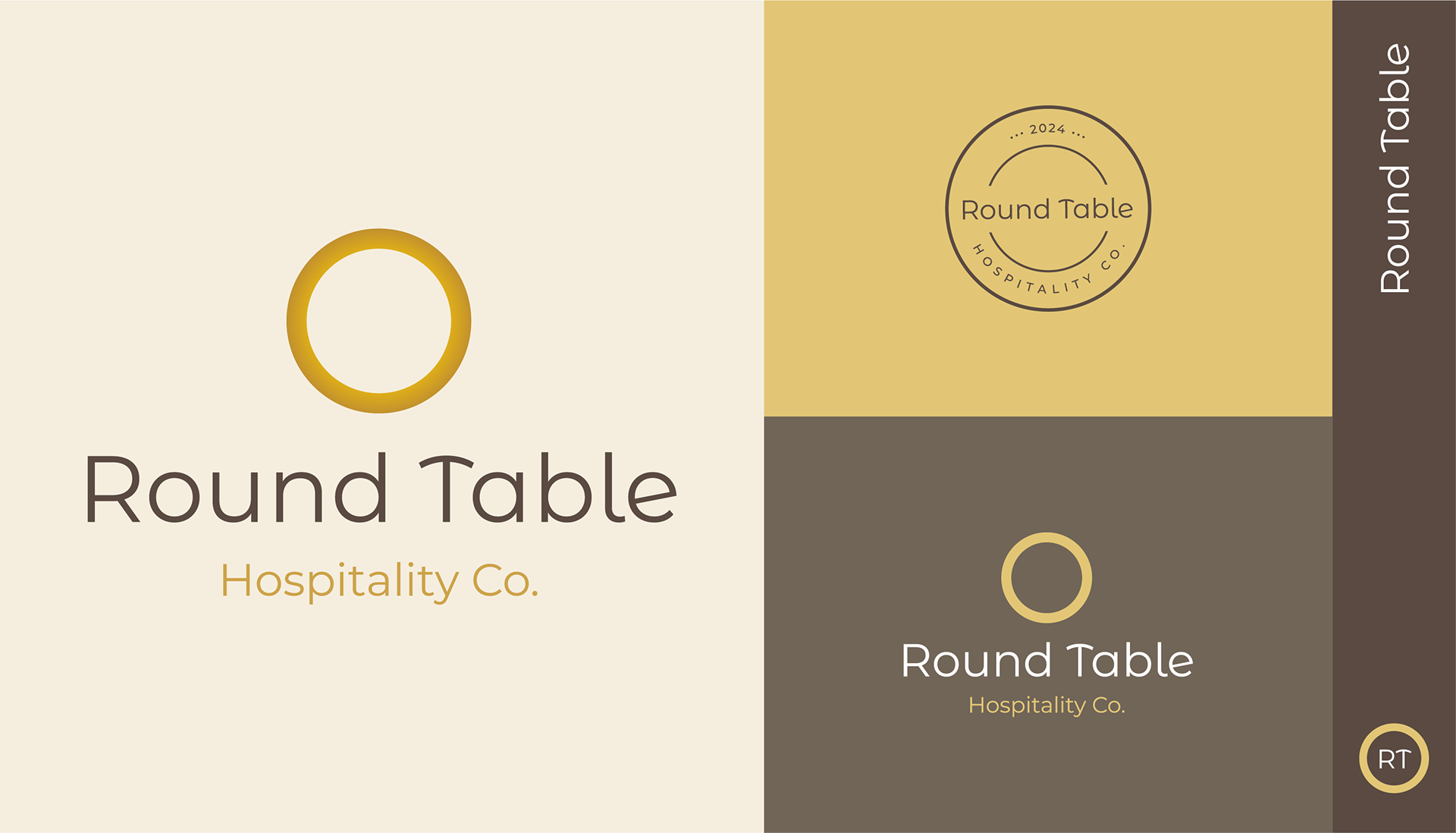
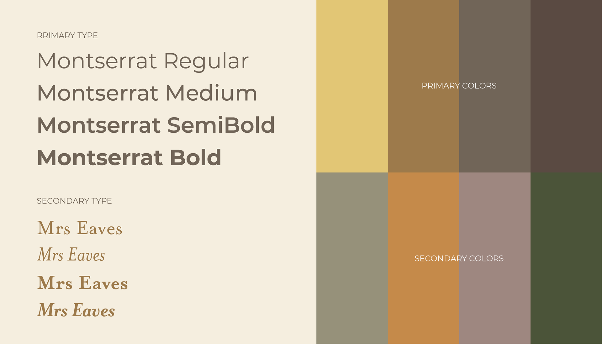
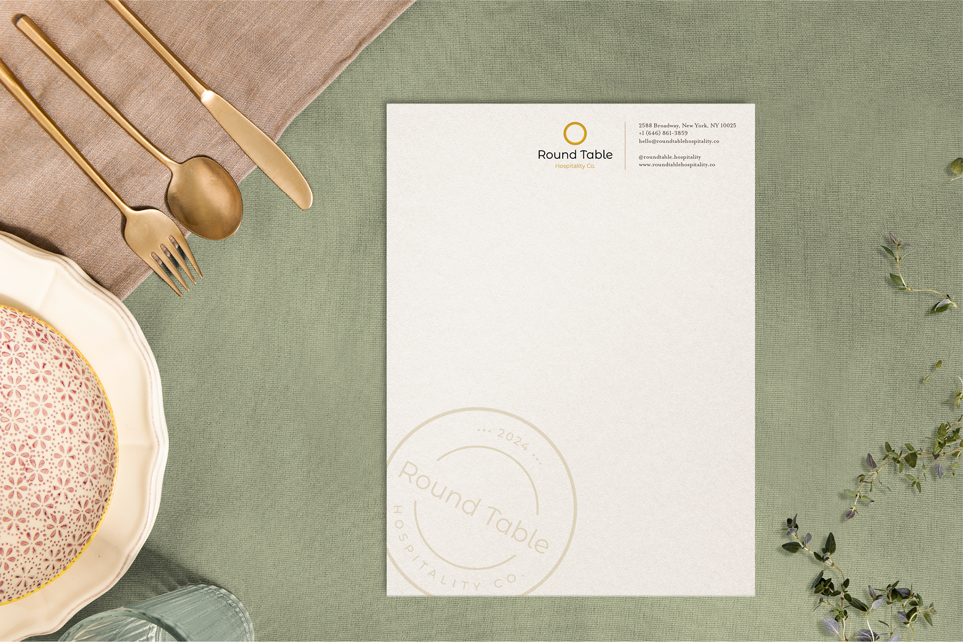
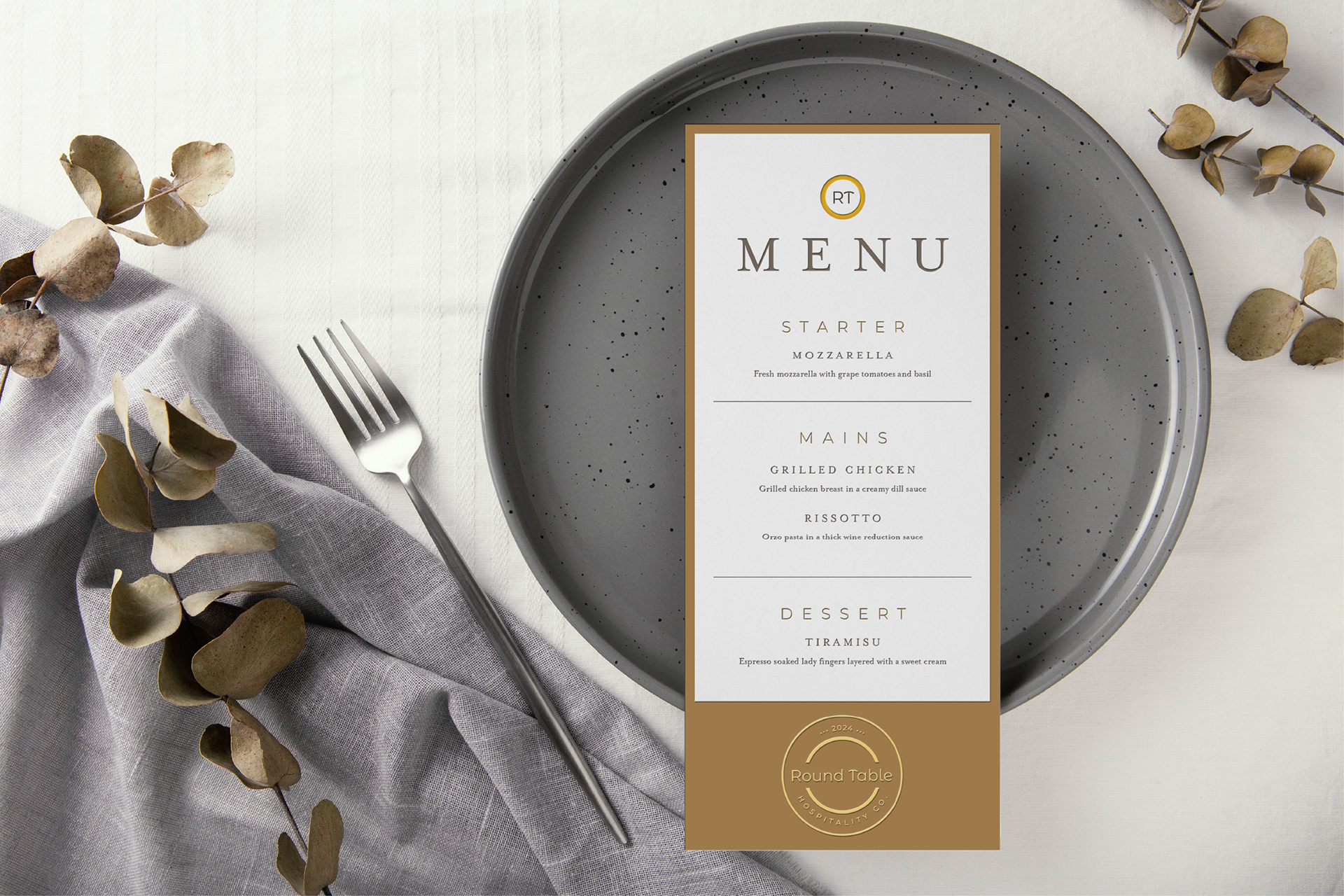
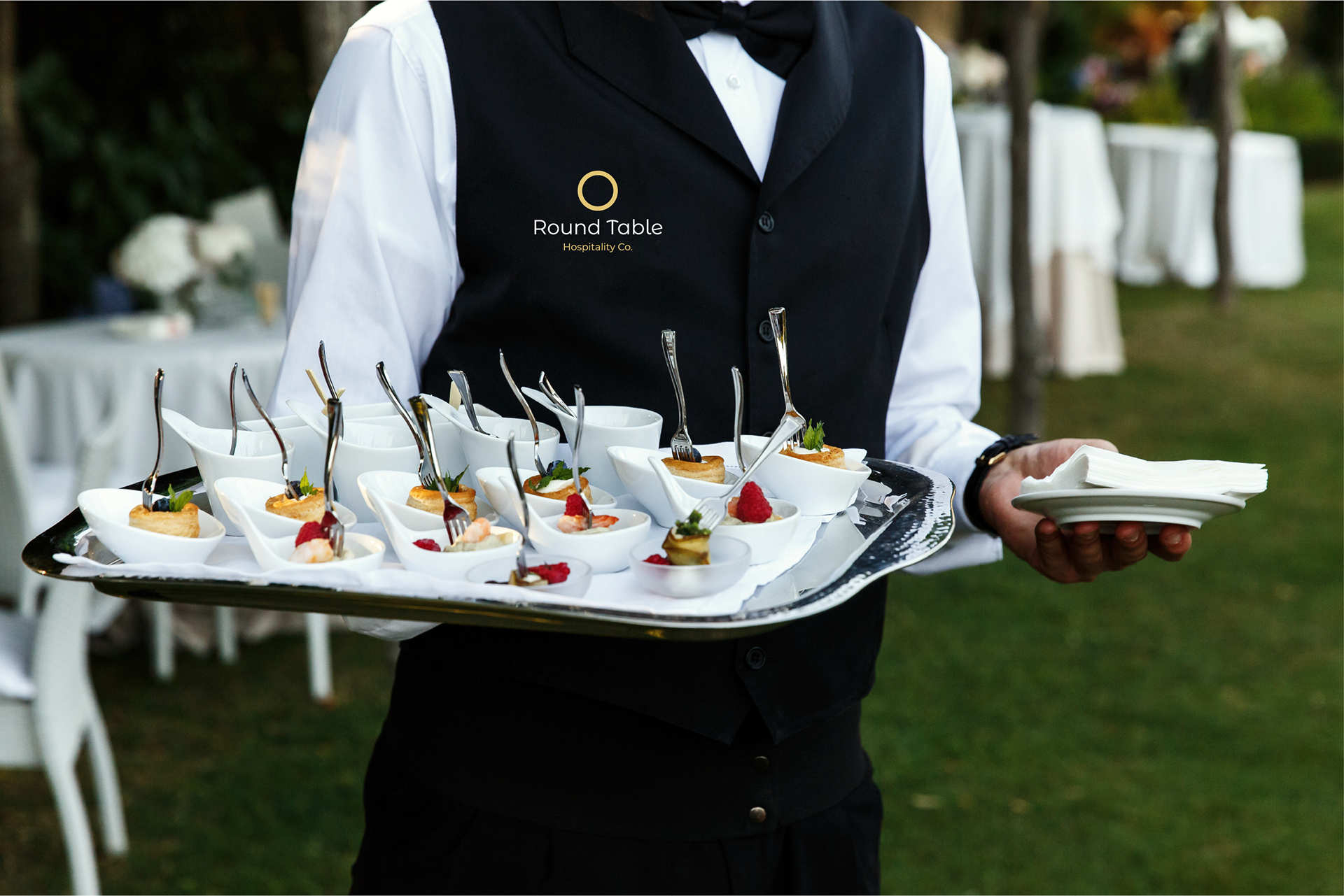
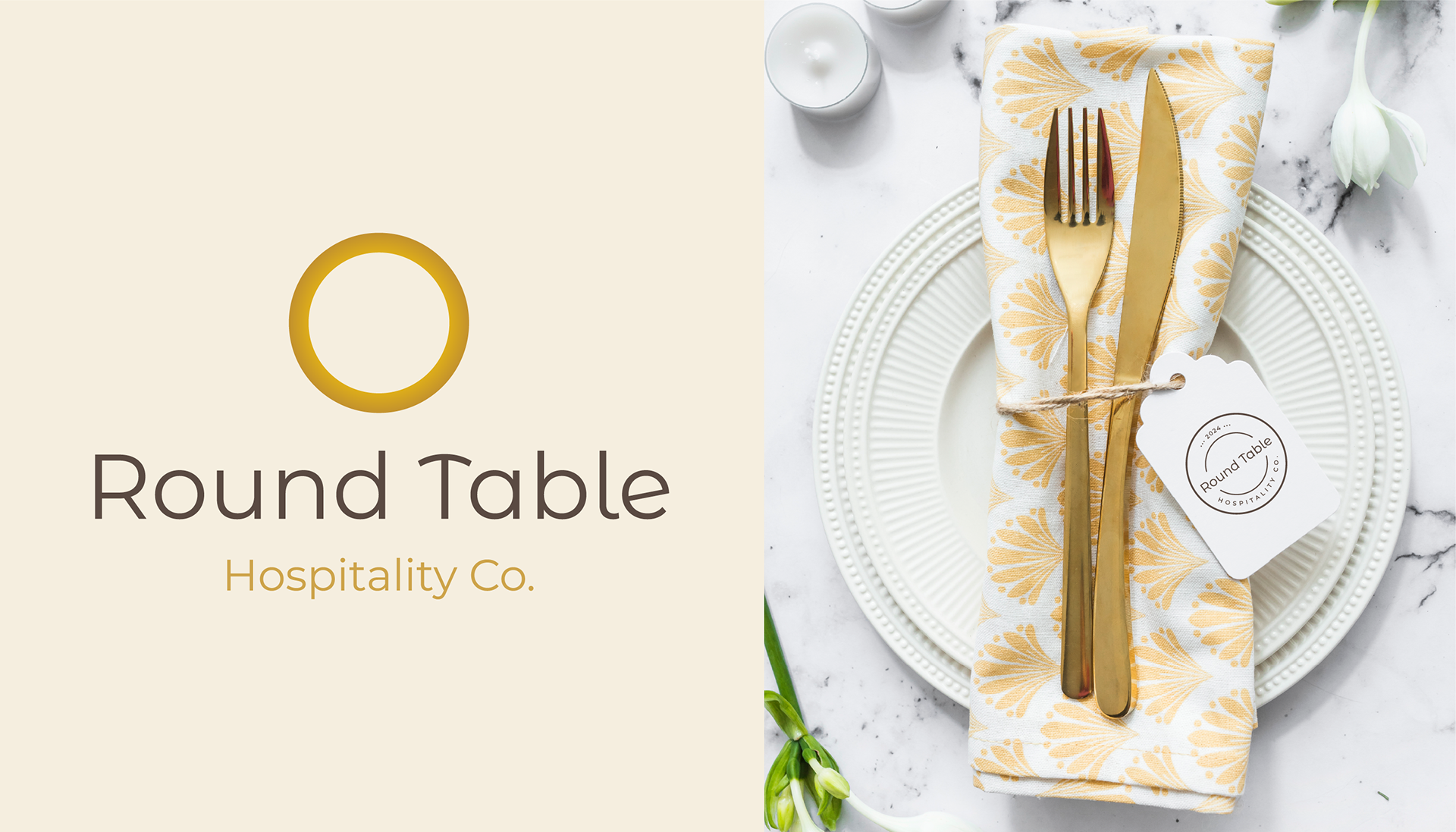
At Kalākattā Studio, we developed a modern and meaningful identity system centered around a circular icon, symbolizing the essence of a “round table.” The prominent gold ring represents collaboration, inclusivity, and shared experiences — the core values behind the brand’s inception. The wordmark, set in the Montserrat font family as the primary typeface and paired with Mrs Eaves as the secondary, strikes a balance between modern geometry and timeless warmth.
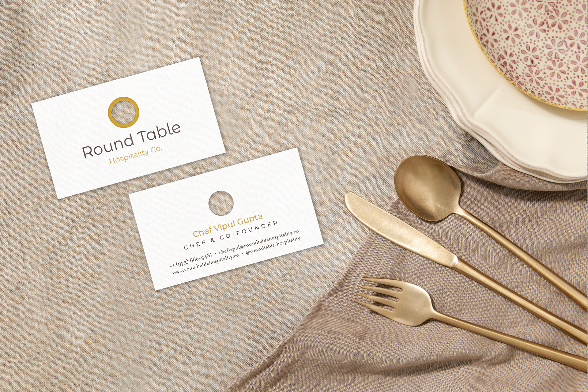
The color palette combines gold and brown tones to convey luxury and reliability, complemented by tertiary shades of green, magenta, and orange used selectively for events to add vibrancy and flexibility. A unique highlight was the business card design — featuring a circular see-through hole that subtly echoes the brand icon and brings the “round table” concept to life. A custom stamp was also created for use at catering events on napkins and buffet stands, extending the brand identity into tactile, on-site details.
The identity translated seamlessly across print and digital touchpoints, from business materials and presentations to catering contracts, strengthening Round Table Hospitality’s image as a symbol of collaboration, quality, and innovation in the modern dining landscape.