25 LOGOS IN 25 WEEKS!
BACKGROUND
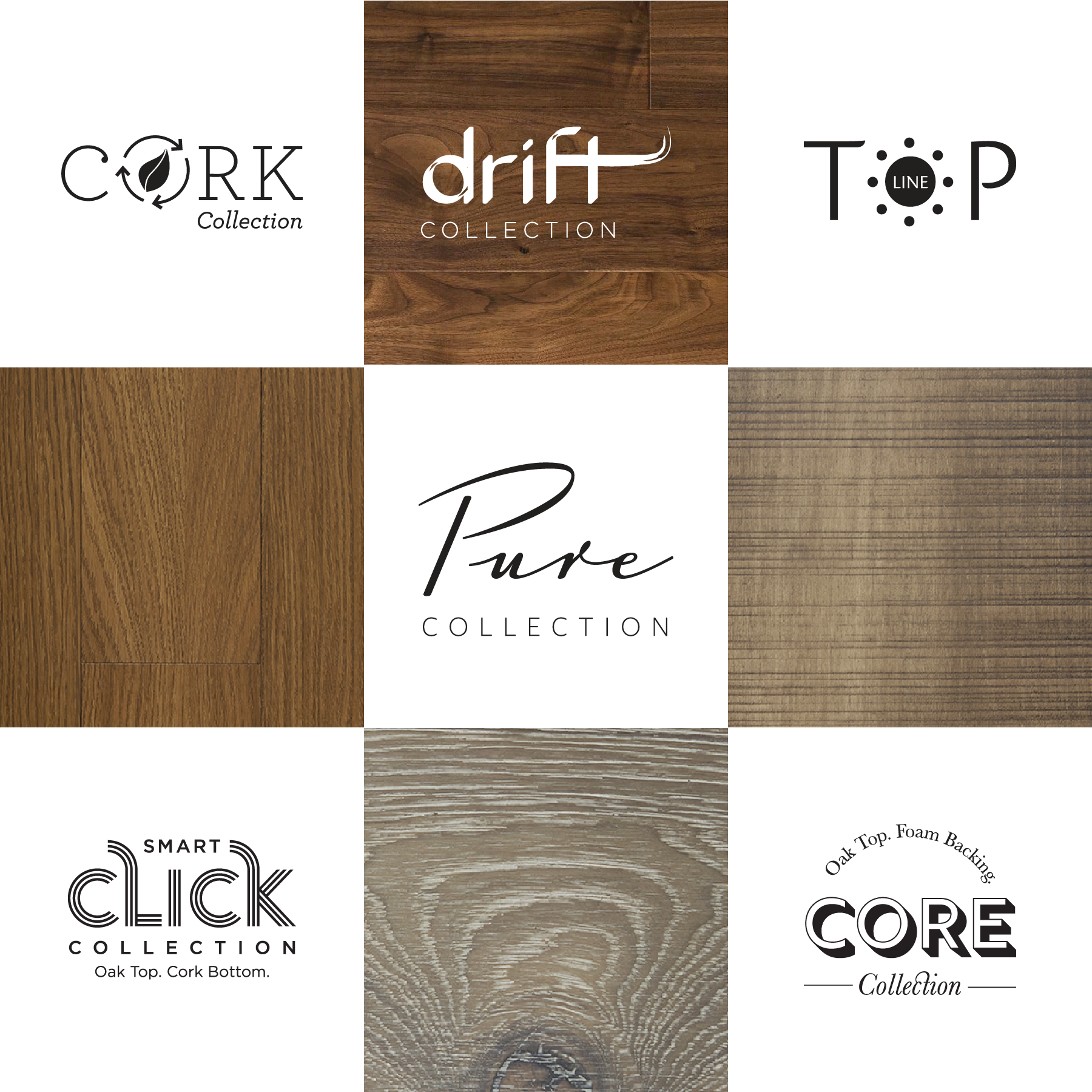
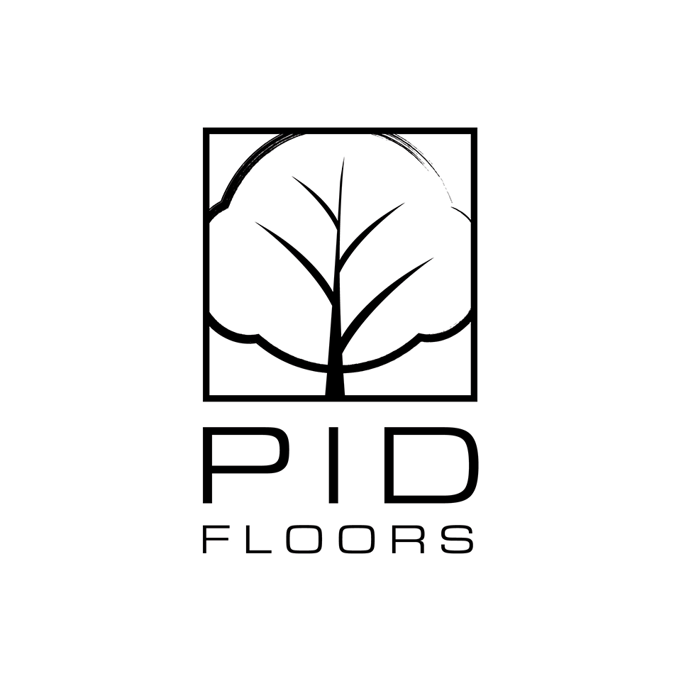
PID Floors is a leader in hardwood flooring, offering a variety of styles, themes and finishes to suit virtually any need. Their focus on quality products and sustainability is what sets them apart from most other flooring suppliers.
THE TASK
To create unique identities for each of their collections.
THE SOLUTION
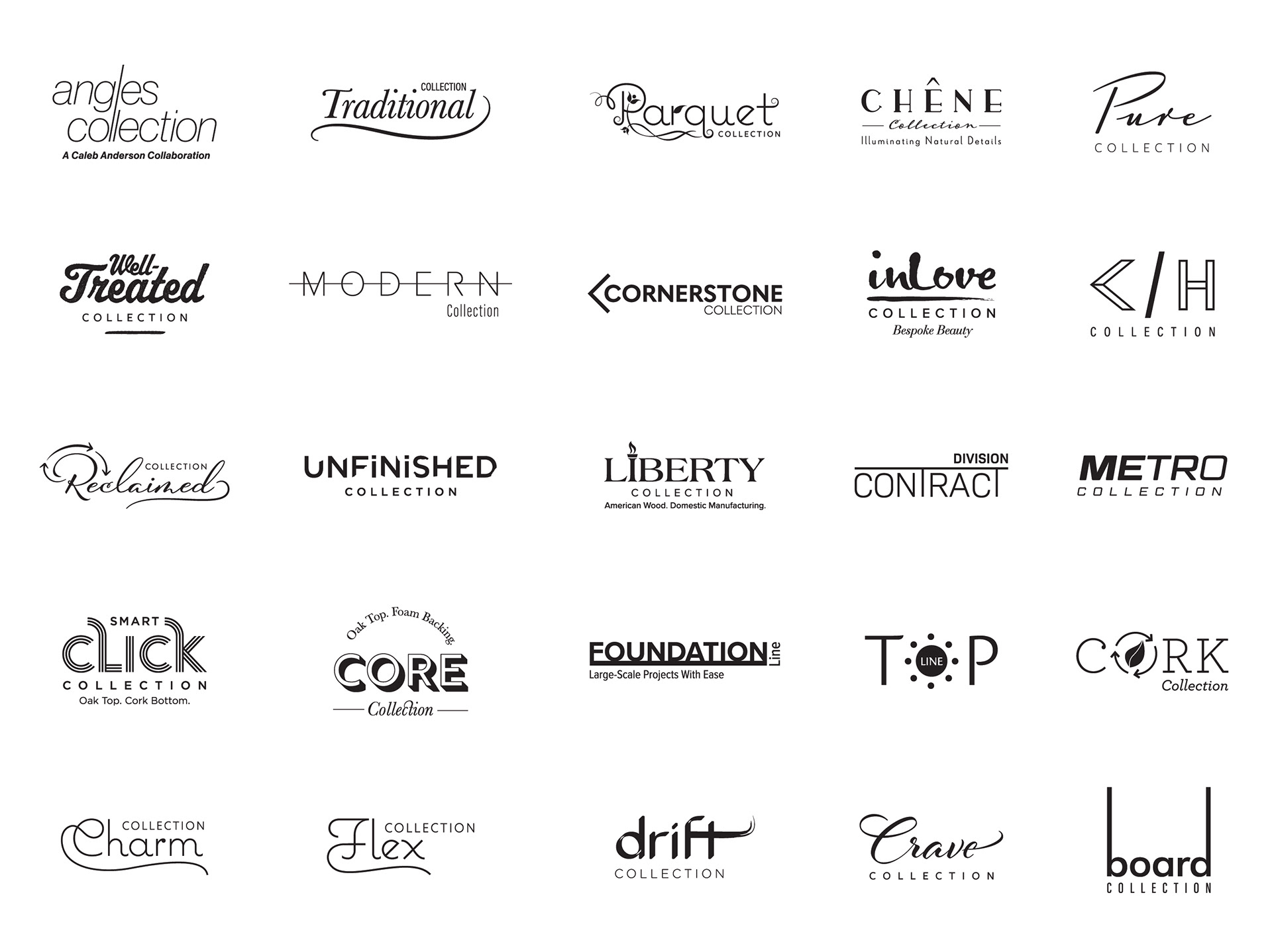
Keeping the values of the umbrella brand in mind, we decided to design monochromatic collection logos where the unique features of each collection are showcased through clever design elements and minimalistic nuances of typography.
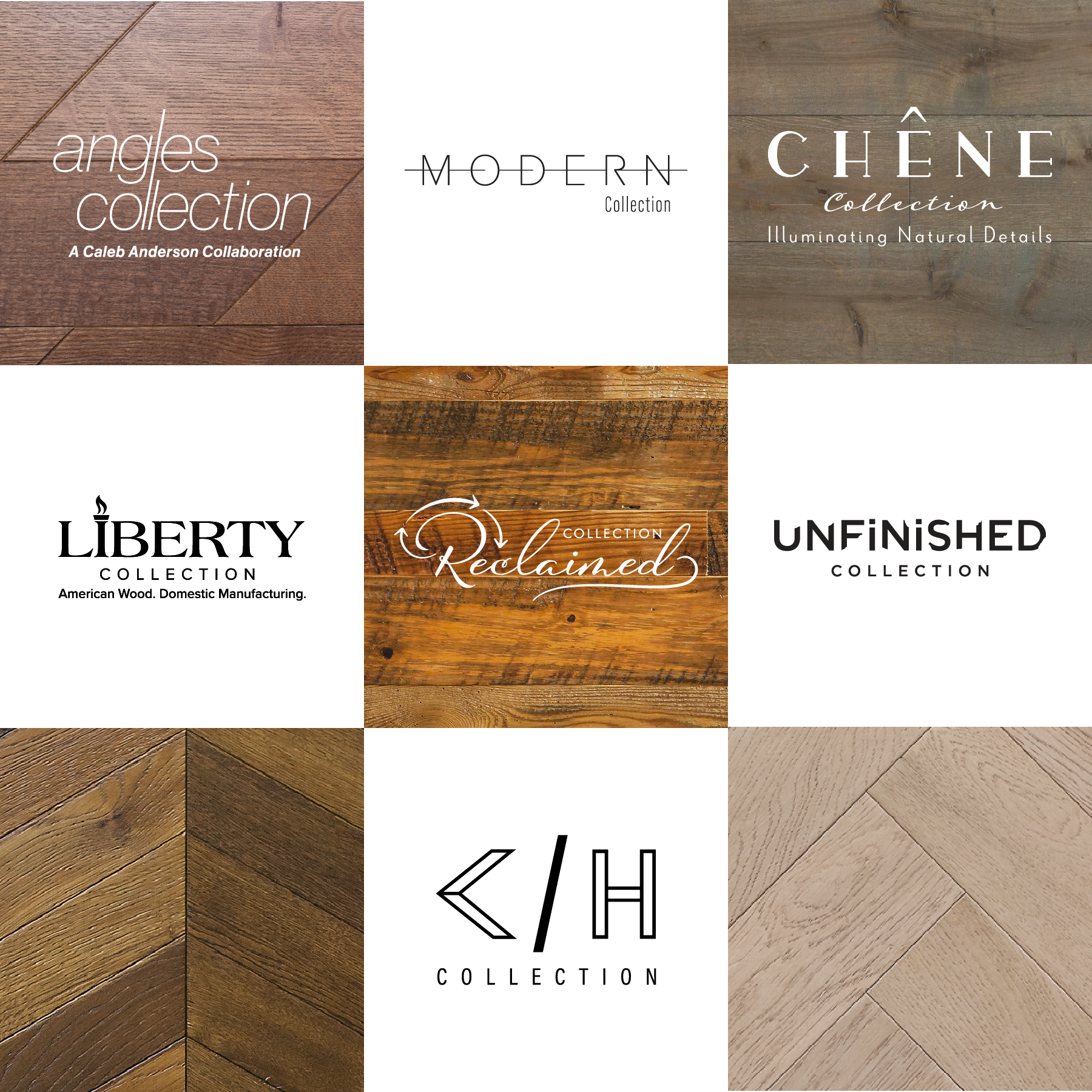
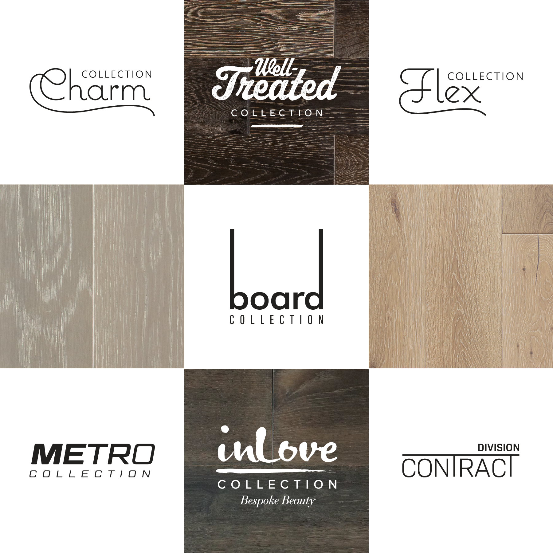
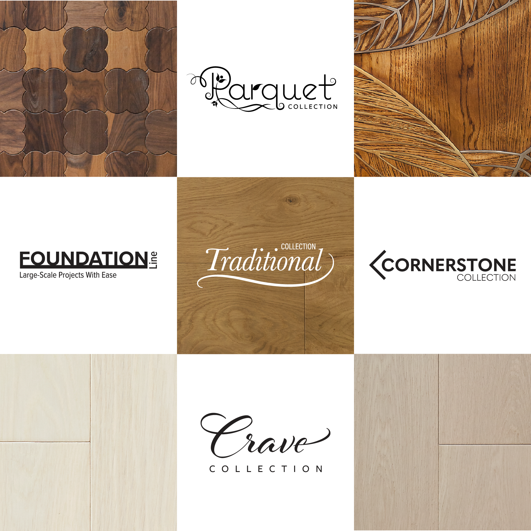
As the name of the collection is ‘Angle’, the wordmark is beautifully angled. We incorporated the torch in the logo-mark that symbolises the Statue of Liberty for the special ‘Made in America’ - Liberty Collection. The Reclaimed and Cork Collections uses a stylized ‘Recycle’ icon to showcase the recycled and sustainable nature of the collection. For the super wide and long product of the Board Collection, we thought of extending the horizontal bars of the letterforms ‘b’ and ‘d’ to depict its nature. The letterforms ‘C’ and ‘H’ are inspired by the pattern of the Chevron and Herringbone respectively. We created an elegant custom lettering for the word-mark - Parquet Collection, while using French-inspired typography for the Chene Collection.
We brought out the essence of the raw and grungy finish of the Well-Treated and Drift Collections with playful use of textures and rough brush strokes. The artistic treatment of the inLove Collection depicts the handmade nature of the flooring. We utilised layered typography for the Smart Click and Core Collections to highlight the special layer base system and to highlight 5 available colors in the Metro Collection, five letters in the word ‘Metro’ are laid out in the five different weights of the same font.
THE RESULT
Our efforts helped give each collection a distinct identity that highlights a key feature or
function of the product line.